Facets can be a great way to visualize your data. Sometimes it helps to look at what different combinations of data look like & what may be missing. I used the Superbowl commercials data set available in the #TidyTuesday github repo to introduce facets here. When visualizing multiple groups, facets can really help in making a figure with multiple panels all aligned nicely with a good-looking aesthetic.
I’m also trying something a bit new with this post. I’m posting the code in tidyverse & then the same code in data.table. When I first learned R, I used primarily the tidyverse. When I started my current position, they use data.table more due to the size of the data sets. It’s been fun learning how to use data.table. I’m challenging myself here to try & write the same code in fewer lines using data.table.
Ok. That’s enough of that! Let’s get started!
First, let’s load the libraries we are going to use, read in the data & take a quick peek at it!
library(tidyverse)
library(data.table)
library(viridis) # for color scheme in plots

youtube = readr::read_csv('https://raw.githubusercontent.com/rfordatascience/tidytuesday/master/data/2021/2021-03-02/youtube.csv')

head(youtube)
## # A tibble: 6 x 25
##    year brand  superbowl_ads_dot_… youtube_url  funny show_product_qu… patriotic
##   <dbl> <chr>  <chr>               <chr>        <lgl> <lgl>            <lgl>
## 1  2018 Toyota https://superbowl-… https://www… FALSE FALSE            FALSE
## 2  2020 Bud L… https://superbowl-… https://www… TRUE  TRUE             FALSE
## 3  2006 Bud L… https://superbowl-… https://www… TRUE  FALSE            FALSE
## 4  2018 Hynud… https://superbowl-… https://www… FALSE TRUE             FALSE
## 5  2003 Bud L… https://superbowl-… https://www… TRUE  TRUE             FALSE
## 6  2020 Toyota https://superbowl-… https://www… TRUE  TRUE             FALSE
## # … with 18 more variables: celebrity <lgl>, danger <lgl>, animals <lgl>,
## #   use_sex <lgl>, id <chr>, kind <chr>, etag <chr>, view_count <dbl>,
## #   like_count <dbl>, dislike_count <dbl>, favorite_count <dbl>,
## #   comment_count <dbl>, published_at <dttm>, title <chr>, description <chr>,
## #   thumbnail <chr>, channel_title <chr>, category_id <dbl>
The Tidyverse way 
Looks good! First thing I’d like to do is select the columns I’m going to use & drop the rest. I prefer to filter my data in the early steps to save computational time in the long run. Here I’m going to use select() and the column names to specify which columns I want to keep.
youtube %>%
  select(year, brand, view_count, like_count, dislike_count)
## # A tibble: 247 x 5
##     year brand     view_count like_count dislike_count
##    <dbl> <chr>          <dbl>      <dbl>         <dbl>
##  1  2018 Toyota        173929       1233            38
##  2  2020 Bud Light      47752        485            14
##  3  2006 Bud Light     142310        129            15
##  4  2018 Hynudai          198          2             0
##  5  2003 Bud Light      13741         20             3
##  6  2020 Toyota         23636        115            11
##  7  2020 Coca-Cola     304254       1470           384
##  8  2020 Kia            17892         78             6
##  9  2020 Hynudai        38385        342             7
## 10  2020 Budweiser        782          7             0
## # … with 237 more rows
Now I want to summarize my data. I’d like to find the total number of views, the total number of likes & the total number of dislikes for each year & brand combination. I’m going to use group_by() to get all the year/brand combos. Then use a summarise() command to make my new columns. For each new column, I’ll use sum() to calculate the new total. I also added in na.rm = TRUE to drop anny NAs in the data. Let’s see how it looks!
youtube %>%
  select(year, brand, view_count, like_count, dislike_count) %>%
  group_by(year, brand) %>%
  summarise(total_view = sum(view_count, na.rm = TRUE),
            total_like = sum(like_count, na.rm = TRUE),
            total_dislike = sum(dislike_count, na.rm = TRUE))
## `summarise()` has grouped output by 'year'. You can override using the `.groups` argument.
## # A tibble: 131 x 5
## # Groups:   year [21]
##     year brand     total_view total_like total_dislike
##    <dbl> <chr>          <dbl>      <dbl>         <dbl>
##  1  2000 Bud Light       6641          7             1
##  2  2000 Budweiser    3741328      25013           527
##  3  2000 E-Trade        76218        172             6
##  4  2001 Bud Light      64573        281            10
##  5  2001 Budweiser     127230        485             7
##  6  2001 Doritos         2985         15             0
##  7  2001 E-Trade       109946        179            11
##  8  2001 NFL                0          0             0
##  9  2001 Pepsi          79531        137             7
## 10  2002 Bud Light     138770        480            20
## # … with 121 more rows
Next I’m going to calculate the percentage of likes & percentage of dislikes for each row using mutate().
youtube %>%
  select(year, brand, view_count, like_count, dislike_count) %>%
  group_by(year, brand) %>%
  summarise(total_view = sum(view_count, na.rm = TRUE),
            total_like = sum(like_count, na.rm = TRUE),
            total_dislike = sum(dislike_count, na.rm = TRUE)) %>%
  mutate(pct_like = (total_like/total_view) * 100,
         pct_dislike = (total_dislike/total_view) * 100)
## `summarise()` has grouped output by 'year'. You can override using the `.groups` argument.
## # A tibble: 131 x 7
## # Groups:   year [21]
##     year brand     total_view total_like total_dislike pct_like pct_dislike
##    <dbl> <chr>          <dbl>      <dbl>         <dbl>    <dbl>       <dbl>
##  1  2000 Bud Light       6641          7             1    0.105     0.0151
##  2  2000 Budweiser    3741328      25013           527    0.669     0.0141
##  3  2000 E-Trade        76218        172             6    0.226     0.00787
##  4  2001 Bud Light      64573        281            10    0.435     0.0155
##  5  2001 Budweiser     127230        485             7    0.381     0.00550
##  6  2001 Doritos         2985         15             0    0.503     0
##  7  2001 E-Trade       109946        179            11    0.163     0.0100
##  8  2001 NFL                0          0             0  NaN       NaN
##  9  2001 Pepsi          79531        137             7    0.172     0.00880
## 10  2002 Bud Light     138770        480            20    0.346     0.0144
## # … with 121 more rows
Last of all, I’d like to replace all NAs with 0 using replace() & then use select() to keep only the columns I’m going to use. Also, I’ll use the first line (plot_df = youtube %>%) to save the data frame. I added in a head() command so we can see what the final data frame looks like.
# The tidyverse way
plot_df = youtube %>%
  select(year, brand, view_count, like_count, dislike_count) %>%
  group_by(year, brand) %>%
  summarise(total_view = sum(view_count, na.rm = TRUE),
            total_like = sum(like_count, na.rm = TRUE),
            total_dislike = sum(dislike_count, na.rm = TRUE)) %>%
  mutate(pct_like = (total_like/total_view) * 100,
         pct_dislike = (total_dislike/total_view) * 100) %>%
  replace(is.na(.), 0) %>%
  select(year, brand, pct_like, pct_dislike)
## `summarise()` has grouped output by 'year'. You can override using the `.groups` argument.
head(plot_df)
## # A tibble: 6 x 4
## # Groups:   year [2]
##    year brand     pct_like pct_dislike
##   <dbl> <chr>        <dbl>       <dbl>
## 1  2000 Bud Light    0.105     0.0151
## 2  2000 Budweiser    0.669     0.0141
## 3  2000 E-Trade      0.226     0.00787
## 4  2001 Bud Light    0.435     0.0155
## 5  2001 Budweiser    0.381     0.00550
## 6  2001 Doritos      0.503     0
The data.table way 
Now let’s look at the data.table way to do this. First, let’s get the columns we want to keep. To access data in our data.table, we use the following syntax: data_table[rows_to_keep, columns_to_keep]. You can select rows & columns by numeric index or by name. If you leave either option blank, then it still return all the rows or columns. Here we are going to use a list to select the columns we want to keep. I also used as.data.table() to save it as a data.table object.
plot_df = as.data.table(youtube[, c("year", "brand", "view_count", "like_count", "dislike_count")])

head(plot_df)
##    year     brand view_count like_count dislike_count
## 1: 2018    Toyota     173929       1233            38
## 2: 2020 Bud Light      47752        485            14
## 3: 2006 Bud Light     142310        129            15
## 4: 2018   Hynudai        198          2             0
## 5: 2003 Bud Light      13741         20             3
## 6: 2020    Toyota      23636        115            11
Next, I want to create 3 new columns: total_view, total_like, & total_dislike. In this case, there are 3 positions inside our square brackets: [rows, columns, by].
- I’m going to leave rows blank because I want to keep them all.
- I’m going to use lists to create all 3 columns in one step.
- I’m going to start with a list of the names I want for my new columns:
c("total_view", "total_like", "total_dislike"). - I’m going to use the
:=operator. This is a function within the data.table package that allows for fast adding, removing & updating of columns. - Then I’ll use another list to specify how to find the value for each of these new columns:
list(sum(view_count, na.rm = TRUE), sum(like_count, na.rm = TRUE), sum(dislike_count, na.rm = TRUE)). - The first calculation (
sum(view_count, na.rm = TRUE)) in this list will be assigned to the first name (total_view) in my column name list.
- I’m going to start with a list of the names I want for my new columns:
- I will use
byto perform these calculations for each combination (grouping) of year/brand.
setDT(plot_df)[, c("total_view", "total_like", "total_dislike") :=
                 list(sum(view_count, na.rm = TRUE), sum(like_count, na.rm = TRUE),
                      sum(dislike_count, na.rm = TRUE)),
               by = c("year", "brand")]

head(plot_df)
##    year     brand view_count like_count dislike_count total_view total_like
## 1: 2018    Toyota     173929       1233            38     527442       2681
## 2: 2020 Bud Light      47752        485            14      47752        485
## 3: 2006 Bud Light     142310        129            15     237665        457
## 4: 2018   Hynudai        198          2             0        198          2
## 5: 2003 Bud Light      13741         20             3     533505        648
## 6: 2020    Toyota      23636        115            11      23636        115
##    total_dislike
## 1:           260
## 2:            14
## 3:            29
## 4:             0
## 5:            47
## 6:            11
I can use a similar approach to create 2 new columns for percent: pct_like & pct_dislike.
- I’ll leave rows blank because I don’t want to change/filter those.
- Use lists to create my 2 new columns.
- First the list of new column names:
c("pct_like", "pct_dislike"). - Then our operator:
:=. - Then a second list to specify how I want these values calculated:
list((total_like/total_view) * 100, (total_dislike/total_view) * 100).
- First the list of new column names:
- I’m not using
byhere because I want this calculation performed on every row not on specific groupings.
plot_df[, c("pct_like", "pct_dislike") := list((total_like/total_view) * 100,
                                               (total_dislike/total_view) * 100)]

head(plot_df)
##    year     brand view_count like_count dislike_count total_view total_like
## 1: 2018    Toyota     173929       1233            38     527442       2681
## 2: 2020 Bud Light      47752        485            14      47752        485
## 3: 2006 Bud Light     142310        129            15     237665        457
## 4: 2018   Hynudai        198          2             0        198          2
## 5: 2003 Bud Light      13741         20             3     533505        648
## 6: 2020    Toyota      23636        115            11      23636        115
##    total_dislike  pct_like pct_dislike
## 1:           260 0.5083023 0.049294520
## 2:            14 1.0156643 0.029318144
## 3:            29 0.1922875 0.012202049
## 4:             0 1.0101010 0.000000000
## 5:            47 0.1214609 0.008809664
## 6:            11 0.4865459 0.046539178
Last of all, I will replace any NAs with 0 & select only the columns I’ll be using.
plot_df[is.na(plot_df)] = 0
plot_df = plot_df[, c("year", "brand", "pct_like", "pct_dislike")]

head(plot_df)
##    year     brand  pct_like pct_dislike
## 1: 2018    Toyota 0.5083023 0.049294520
## 2: 2020 Bud Light 1.0156643 0.029318144
## 3: 2006 Bud Light 0.1922875 0.012202049
## 4: 2018   Hynudai 1.0101010 0.000000000
## 5: 2003 Bud Light 0.1214609 0.008809664
## 6: 2020    Toyota 0.4865459 0.046539178
For reference, here is the entire data.table process in one code chunk.
# The data table way
plot_df = as.data.table(youtube[, c("year", "brand", "view_count", "like_count", "dislike_count")])
setDT(plot_df)[, c("total_view", "total_like", "total_dislike") :=
                 list(sum(view_count, na.rm = TRUE), sum(like_count, na.rm = TRUE),
                      sum(dislike_count, na.rm = TRUE)),
               by = c("year", "brand")]
plot_df[, c("pct_like", "pct_dislike") := list((total_like/total_view) * 100,
                                               (total_dislike/total_view) * 100)]
plot_df[is.na(plot_df)] = 0
plot_df = plot_df[, c("year", "brand", "pct_like", "pct_dislike")]

head(plot_df)
##    year     brand  pct_like pct_dislike
## 1: 2018    Toyota 0.5083023 0.049294520
## 2: 2020 Bud Light 1.0156643 0.029318144
## 3: 2006 Bud Light 0.1922875 0.012202049
## 4: 2018   Hynudai 1.0101010 0.000000000
## 5: 2003 Bud Light 0.1214609 0.008809664
## 6: 2020    Toyota 0.4865459 0.046539178
Let’s get to plottin! 
First, we need to reshape our data frame from wide to long. Here I’ll use melt() from the reshape2 package to do that.
plot_df = reshape2::melt(plot_df, id.vars = c("year", "brand"))

# Hyundai is misspelled. Let's fix that.
plot_df$brand = if_else(plot_df$brand == "Hynudai", "Hyundai", plot_df$brand)

head(plot_df)
##   year     brand variable     value
## 1 2018    Toyota pct_like 0.5083023
## 2 2020 Bud Light pct_like 1.0156643
## 3 2006 Bud Light pct_like 0.1922875
## 4 2018   Hyundai pct_like 1.0101010
## 5 2003 Bud Light pct_like 0.1214609
## 6 2020    Toyota pct_like 0.4865459
Let’s talk a little bit about facets. The idea of facets is to break down a more complex data set into smaller groups by one variable. For example, we have all this data for multiple years. Rather than try to shove all the years in one plot & try to make sense of it, we can use facet_wrap() to make one plot for each year. Thus breaking up our data & making it easier to see & make sense of.
When you’re looking at your data to get an idea of what you have, facets can be a great way to see what combination of variables you have & which ones are missing. Maybe you are missing data for a certain brand in a certain year. Facets would be a very easy way to see that quickly.
Facets are also a really great way to align multiple panels together into a single figure. It takes a lot of the stress out of making sure everything is aligned & in the right color scheme, etc. You can change the aesthetics to make a really great looking figure!
I’m going to show a couple different arrangements of facets. While not all of them will look fantastic, it will give you a bit of an idea of the diversity of things you can visualize with facets.
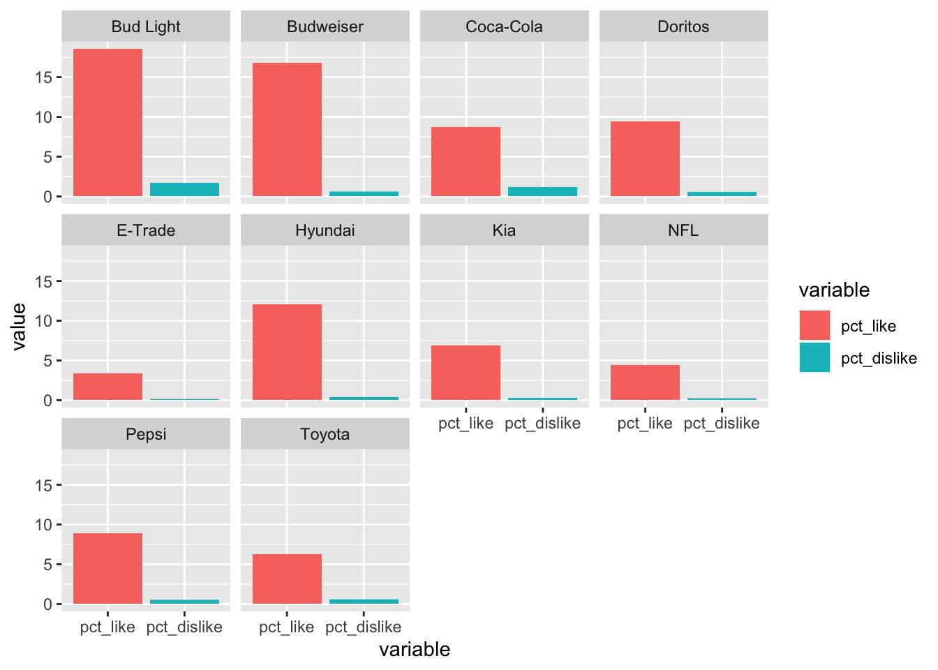
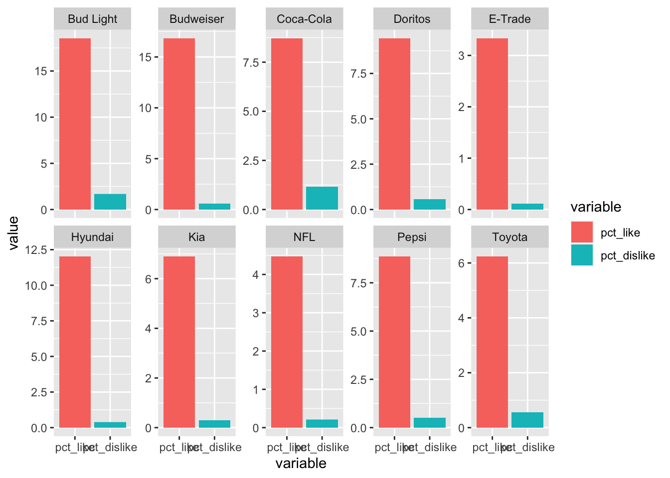
First, let’s facet by brand. We call ggplot() the way we normally would, specifying our x variable, y variable & fill. Then we use geom_bar() to specify the type of plot we want. Then we add facet_wrap(~ brand) to facet these plots by brand.
# facet by brand
ggplot(data = plot_df, aes(x = variable, y = value, fill = variable)) +
  geom_bar(stat = "identity", position = "stack") +
  facet_wrap(~ brand)
Looks neat, right? Next let’s facet by year! We can use the same code, only this time we’ll put year in the facet_wrap() call.
# facet by year
ggplot(data = plot_df, aes(x = variable, y = value, fill = variable)) +
  geom_bar(stat = "identity", position = "stack") +
  facet_wrap(~ year)
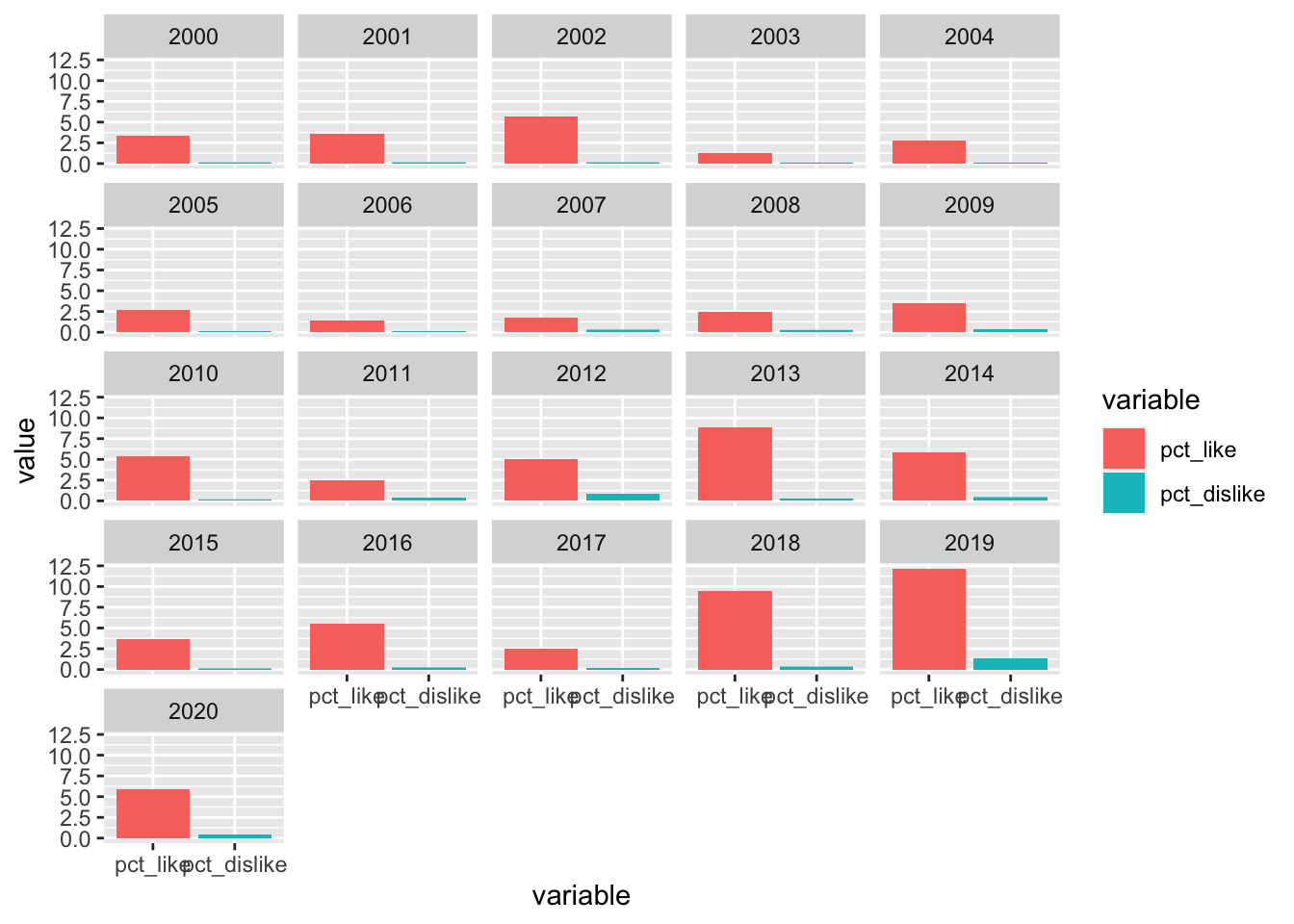
Another good one! We can very quickly see that in 2010 there were way more likes than in the other years.
Now let’s do one better. We can use facet_grid() to show all the combinations of year & brand.
# facet by brand & year
ggplot(data = plot_df, aes(x = variable, y = value, fill = variable)) +
  geom_bar(stat = "identity", position = "stack") +
  facet_grid(year ~ brand)
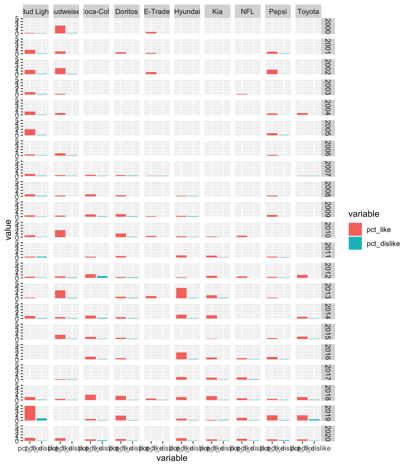
The labels are a bit hard to read but you get the idea! We have all the brands across the top (columns) & all the years along right (rows).
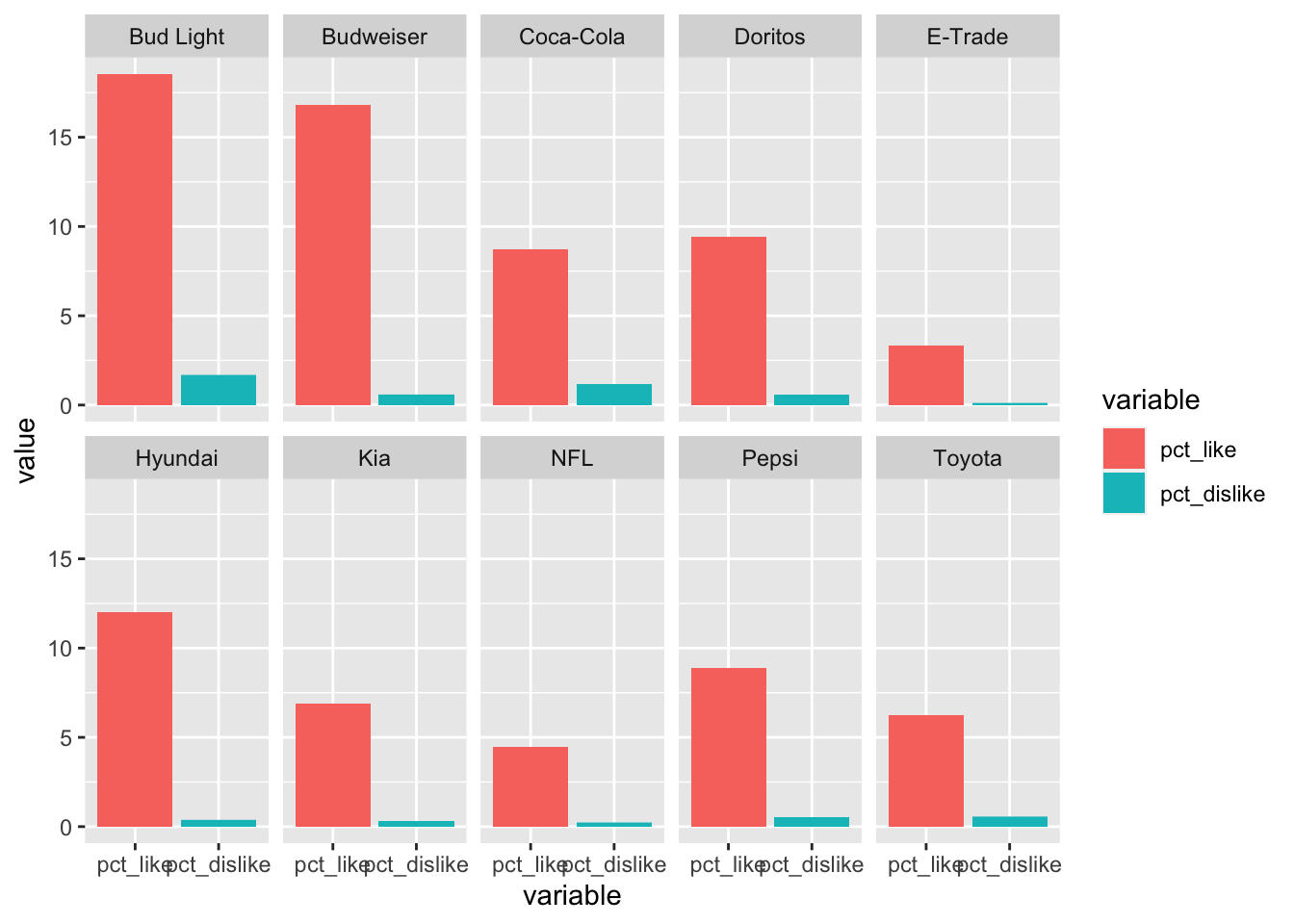
Now let’s take a step back & look at some of the things we can do with these faceted plots. I’m going to work with the plot faceted by brand. We can control the arrangement of the plots by adding either ncol or nrow to the facet_wrap() call.
# facet by brand
ggplot(data = plot_df, aes(x = variable, y = value, fill = variable)) +
  geom_bar(stat = "identity", position = "stack") +
  facet_wrap(~ brand, ncol = 5)
Sometimes it’s helpful to let each plot have it’s own x or y axis. We can do that by adding scales = "free" to the facet_wrap() call. If you only want to “free” on one axis, you can use free_x or free_y. Here we’re going to “free” the y axis.
# facet by brand
ggplot(data = plot_df, aes(x = variable, y = value, fill = variable)) +
  geom_bar(stat = "identity", position = "stack") +
  facet_wrap(~ brand, ncol = 5, scales = "free_y")
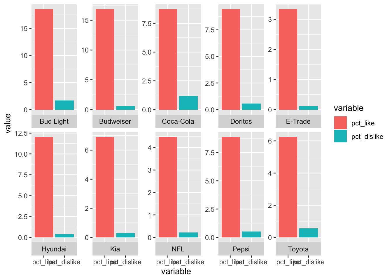
The last thing I want to touch on is how to change the strip position. The strip is the label naming each plot. In the plot above, the strip is the area with the brand name in it. You can choose the position using strip.position() in the facet_wrap() call. The options here are top, bottom, left, right. Here I’m going to move the strips to the bottom.
# facet by brand
ggplot(data = plot_df, aes(x = variable, y = value, fill = variable)) +
  geom_bar(stat = "identity", position = "stack") +
  facet_wrap(~ brand, ncol = 5, scales = "free_y", strip.position = "bottom")
For the final plot here, I’m going to mix it up a bit. I’m going to stick with faceting by brand, but I’m going to color the bars by year instead of by variable. I’m also going to remove the “free” y axis command from facet_wrap().
# facet by brand, fill by year
ggplot(data = plot_df, aes(x = variable, y = value, fill = year)) +
  geom_bar(stat = "identity", position = "stack") +
  facet_wrap(~ brand, ncol = 5, strip.position = "bottom") +
  theme(legend.position = "bottom")
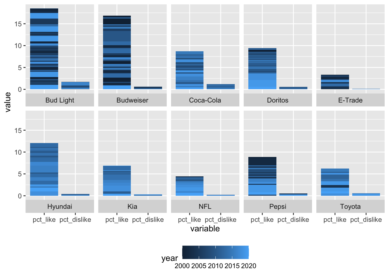
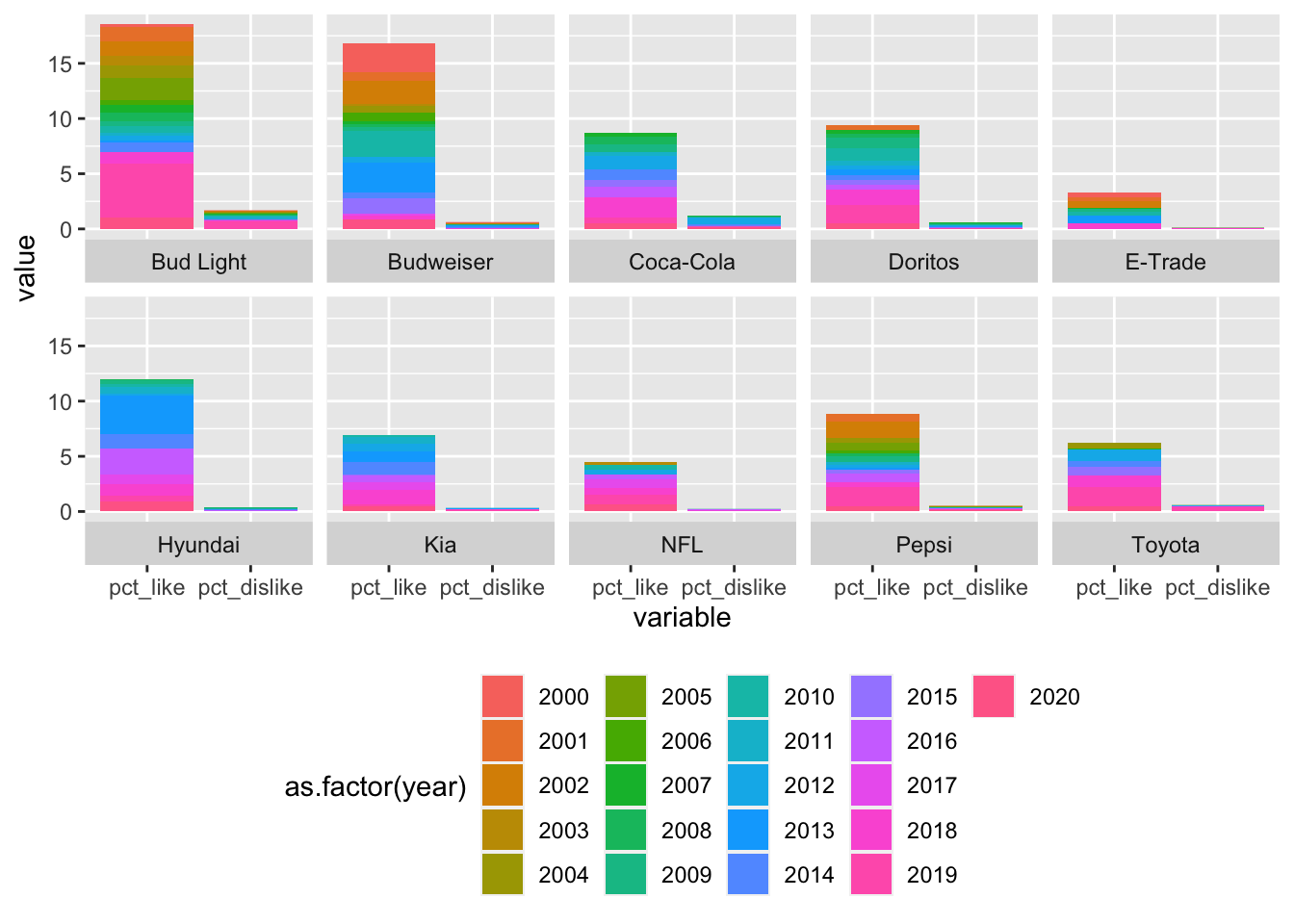
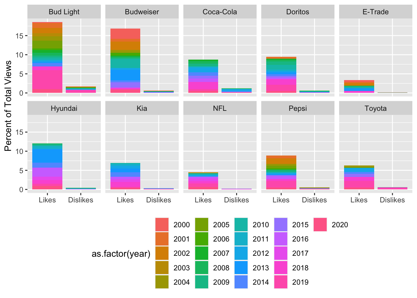
Right now, the year variable is being treated as a numeric variable so it’s on a continuous scale. I would like to put it on a discrete scale. To do this, I’m going to set the fill equal to as.factor(year).
# facet by brand, fill by year
ggplot(data = plot_df, aes(x = variable, y = value, fill = as.factor(year))) +
  geom_bar(stat = "identity", position = "stack") +
  facet_wrap(~ brand, ncol = 5, strip.position = "bottom") +
  theme(legend.position = "bottom")
That looks better! I’m going to move the strip back up to the top & start cleaning up the axes. First off, I’d like to rename the y axis. I’m going to do this using the labs(). Next, I’m going to remove the x axis title by adding axis.title.x = element_blank() to my theme() call. I’m going to use the labels argument of scale_x_discrete() to change the name of the categories on the x axis. I’ll pass a list to the labels argument.
# facet by brand, fill by year
ggplot(data = plot_df, aes(x = variable, y = value, fill = as.factor(year))) +
  geom_bar(stat = "identity", position = "stack") +
  facet_wrap(~ brand, ncol = 5,) +
  labs(y = "Percent of Total Views") +
  scale_x_discrete(labels = c("Likes", "Dislikes")) +
  theme(legend.position = "bottom",
        axis.title.x = element_blank())
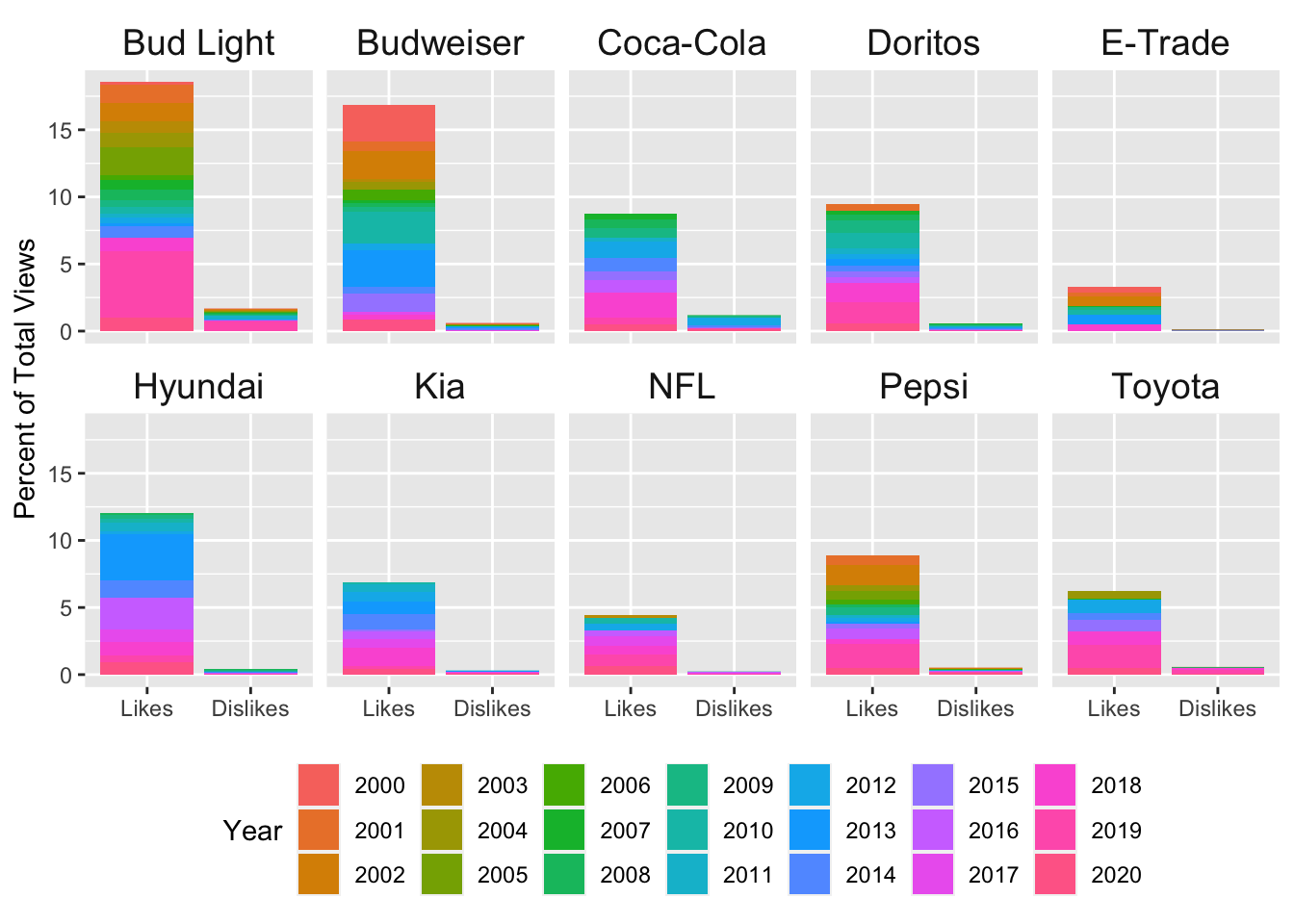
Looking good! Next, I’d like to clean up the legend. I want to change the title & the layout. The way it is right now, it’s taking up way too much space! I’ll add fill = "Year" to the labs() call to change the title of the legend. Then I’ll add guides(fill = guide_legend(nrow = 3)) to change the number of rows in the legend.
# facet by brand, fill by year
ggplot(data = plot_df, aes(x = variable, y = value, fill = as.factor(year))) +
  geom_bar(stat = "identity", position = "stack") +
  facet_wrap(~ brand, ncol = 5,) +
  labs(y = "Percent of Total Views",
       fill = "Year") +
  scale_x_discrete(labels = c("Likes", "Dislikes")) +
  guides(fill = guide_legend(nrow = 3)) +
  theme(legend.position = "bottom",
        axis.title.x = element_blank())

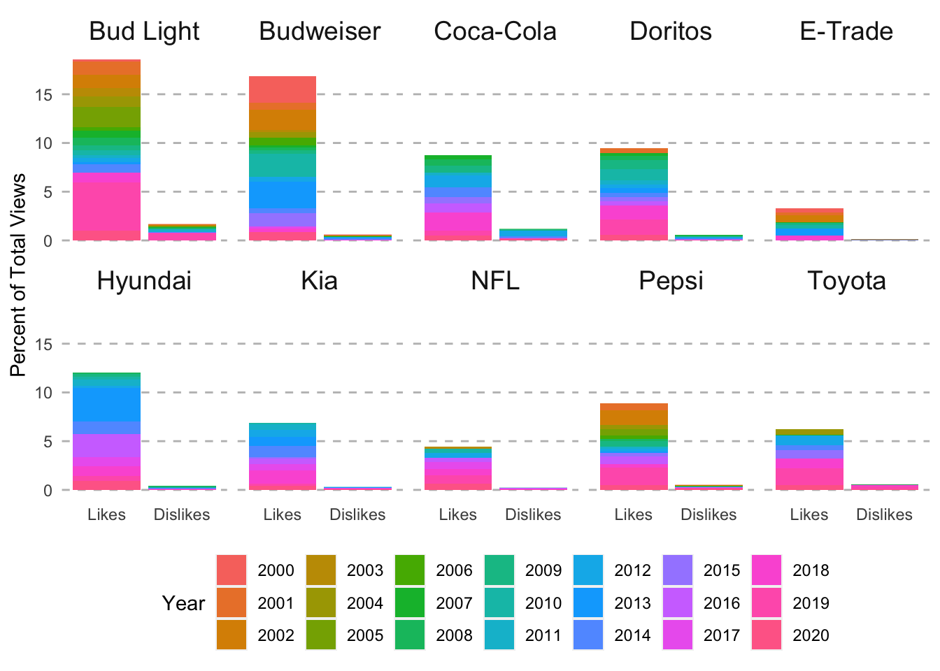
That’s better. Now let’s change up the strips. I’m going to use sstrip.background = element_blank() in the theme call to remove the grey background from the strip. Then I’m going to bump up the font size by using strip.text = element_text(size = 14) in the theme() call.
# facet by brand, fill by year
ggplot(data = plot_df, aes(x = variable, y = value, fill = as.factor(year))) +
  geom_bar(stat = "identity", position = "stack") +
  facet_wrap(~ brand, ncol = 5,) +
  labs(y = "Percent of Total Views",
       fill = "Year") +
  scale_x_discrete(labels = c("Likes", "Dislikes")) +
  guides(fill = guide_legend(nrow = 3)) +
  theme(legend.position = "bottom",
        axis.title.x = element_blank(),
        strip.background = element_blank(),
        strip.text = element_text(size = 14))
Even better! Next I want to remove the panel in the actual plot & change up the grid lines a bit. By using panel.background = element_blank() in the theme() call, I can remove the grey panel background. I will change the y axis grid lines to dsahed grey lines using panel.grid.major.y = element_line(linetype = "dashed", color = "grey") in the theme() call. Last of all, I’ll remove the tick marks from both axes using axis.ticks = element_blank() in the theme() call.
# facet by brand, fill by year
ggplot(data = plot_df, aes(x = variable, y = value, fill = as.factor(year))) +
  geom_bar(stat = "identity", position = "stack") +
  facet_wrap(~ brand, ncol = 5,) +
  labs(y = "Percent of Total Views",
       fill = "Year") +
  scale_x_discrete(labels = c("Likes", "Dislikes")) +
  guides(fill = guide_legend(nrow = 3)) +
  theme(legend.position = "bottom",
        axis.title.x = element_blank(),
        strip.background = element_blank(),
        strip.text = element_text(size = 14),
        panel.background = element_blank(),
        panel.grid.major.y = element_line(linetype = "dashed", color = "grey"),
        axis.ticks = element_blank())
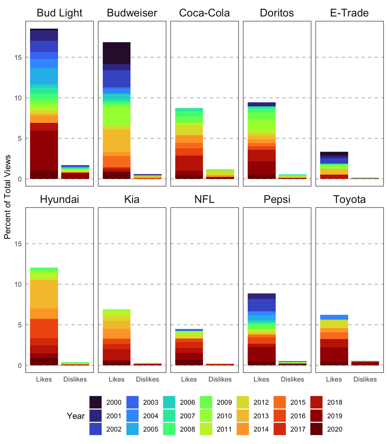
I think I want to add a border to make the panels a bit more clear. I can do this by adding panel.border = element_rect(linetype = "solid", fill = NA) to the theme() call. Last of all, I want to change the colors of each year. I’m going to use on of the new viridis palettes. I’ll add the color palette by adding scale_fill_viridis_d(option = "turbo").
# facet by brand, fill by year
ggplot(data = plot_df, aes(x = variable, y = value, fill = as.factor(year))) +
  geom_bar(stat = "identity", position = "stack") +
  facet_wrap(~ brand, ncol = 5,) +
  labs(y = "Percent of Total Views",
       fill = "Year") +
  scale_x_discrete(labels = c("Likes", "Dislikes")) +
  guides(fill = guide_legend(nrow = 3)) +
  theme(legend.position = "bottom",
        axis.title.x = element_blank(),
        strip.background = element_blank(),
        strip.text = element_text(size = 14),
        panel.background = element_blank(),
        panel.grid.major.y = element_line(linetype = "dashed", color = "grey"),
        axis.ticks = element_blank(),
        panel.border = element_rect(linetype = "solid", fill = NA)) +
  scale_fill_viridis_d(option = "turbo")
Last of all, let’s add in a title here. I’ll add the actual title in labs(). The default in ggplot2 is to left align the title. I prefer mine centered so I’m going to use plot.title = element_text(hjust = 0.5) in the theme() call. I also added size = 17 to change the font size as well.
# facet by brand, fill by year
ggplot(data = plot_df, aes(x = variable, y = value, fill = as.factor(year))) +
  geom_bar(stat = "identity", position = "stack") +
  facet_wrap(~ brand, ncol = 5,) +
  labs(y = "Percent of Total Views",
       fill = "Year",
       title = "Youtube Likes & Dislikes of Superbowl Commercials") +
  scale_x_discrete(labels = c("Likes", "Dislikes")) +
  guides(fill = guide_legend(nrow = 3)) +
  theme(legend.position = "bottom",
        axis.title.x = element_blank(),
        strip.background = element_blank(),
        strip.text = element_text(size = 14),
        panel.background = element_blank(),
        panel.grid.major.y = element_line(linetype = "dashed", color = "grey"),
        axis.ticks = element_blank(),
        panel.border = element_rect(linetype = "solid", fill = NA),
        plot.title = element_text(hjust = 0.5, size = 17)) +
  scale_fill_viridis_d(option = "turbo")
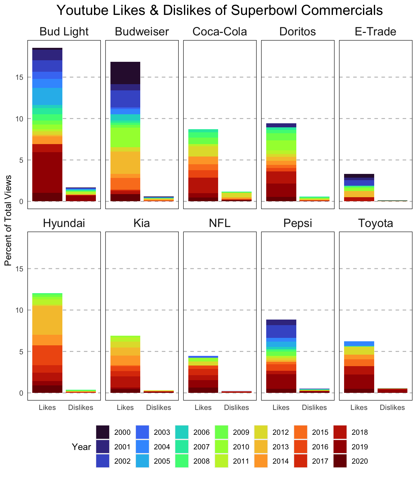
Whew! That was a lot but it looks gooooood! I hope you learned a bit about how to use facets to better visualize your data. Feel free to reach out with any questions/comments/concerns via Twitter or using one of the other methods on my contact page. Thanks for reading!