Recently, I was working through a small analysis for a collaboration & I had to google how to make a box plot in R. I used to do more data viz than I do now. I was a bit bummed to have forgotten some basic plot types so quickly. I thought I would use this post as a quick refresher on some basic plot types in ggplot2.
Let’s get started!
I’m going to work with some #TidyTuesday data here. This data set looks are park availability across US metro areas. The specific cities we’re going to work with are Chicago & Raleigh. We’ve going to be visualizing the amount of money each city spends pre resident over the course of 8 years (2013-2020). A more thorough description of this data set can be found here.
First, we’re going to load the libraries we will be using & read in our data.
library(tidyverse)

parks = read_csv("https://raw.githubusercontent.com/rfordatascience/tidytuesday/master/data/2021/2021-06-22/parks.csv")

head(parks)
## # A tibble: 6 x 28
##    year  rank city         med_park_size_da… med_park_size_poi… park_pct_city_d…
##   <dbl> <dbl> <chr>                    <dbl>              <dbl> <chr>
## 1  2020     1 Minneapolis                5.7                 26 15%
## 2  2020     2 Washington,…               1.4                  5 24%
## 3  2020     3 St. Paul                   3.2                 14 15%
## 4  2020     4 Arlington, …               2.4                 10 11%
## 5  2020     5 Cincinnati                 4.4                 20 14%
## 6  2020     6 Portland                   4.9                 22 18%
## # … with 22 more variables: park_pct_city_points <dbl>,
## #   pct_near_park_data <chr>, pct_near_park_points <dbl>,
## #   spend_per_resident_data <chr>, spend_per_resident_points <dbl>,
## #   basketball_data <dbl>, basketball_points <dbl>, dogpark_data <dbl>,
## #   dogpark_points <dbl>, playground_data <dbl>, playground_points <dbl>,
## #   rec_sr_data <dbl>, rec_sr_points <dbl>, restroom_data <dbl>,
## #   restroom_points <dbl>, splashground_data <dbl>, splashground_points <dbl>,
## #   amenities_points <dbl>, total_points <dbl>, total_pct <dbl>,
## #   city_dup <chr>, park_benches <dbl>
Next let’s create a data frame to use for the different types of plots. We can filter the data by city and year. Next, we’ll select only the columns we’re interested in (year, spend_per_resident_data, city). Then we’ll take a quick peek at the resulting data frame to make sure everything looks good!
parks_dat = parks %>%
  filter((city == "Chicago" | city == "Raleigh") & year >= 2013) %>%
  select(year, spend_per_resident_data, city)

head(parks_dat)
## # A tibble: 6 x 3
##    year spend_per_resident_data city
##   <dbl> <chr>                   <chr>
## 1  2020 $179                    Chicago
## 2  2020 $157                    Raleigh
## 3  2019 $171                    Chicago
## 4  2019 $194                    Raleigh
## 5  2018 $172                    Chicago
## 6  2018 $202                    Raleigh
Rather than add a theme() call to each plot in this post, I’m going to set a “global” theme. You can create this global theme by making a list of the different parameters you would like to pass to each plot. Here I’m starting with theme_bw(). I’m setting the color & fill palettes. I’m also moving the legend to the bottom for each plot using legend.position. This can be added to any ggplot2 object by adding + gglayer_theme.
gglayer_theme <- list(
  theme_bw(),
  scale_color_brewer(palette = "Dark2"),
  scale_fill_brewer(palette = "Dark2"),
  theme(legend.position = "bottom")
)
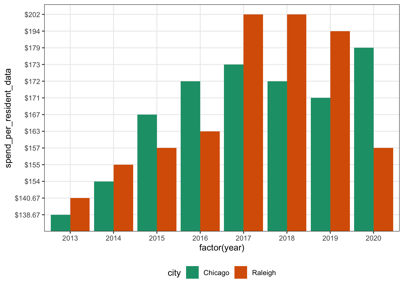
First up, we’ll do a bar plot. Everyone loves a good plot! It’s an easy to read way to share data. Here, I aave year on the x axis & “spend per resident” on the y axis. I have filled the bars based on the city.
A few quirks here: I used factor()to get R to understand that I want to treat the year was a discrete variable & not a continuous variable. I used stat = "identity" to tell R that I want the height of each bar to be the dollar amount spent per resident. Lastly, I used position = "dodge" to get the bars next to each other instead of stacked on top of each other.
ggplot(parks_dat, aes(x = factor(year), y = spend_per_resident_data, fill = city)) +
  geom_bar(aes(group = city), stat = "identity", position = "dodge") +
  gglayer_theme
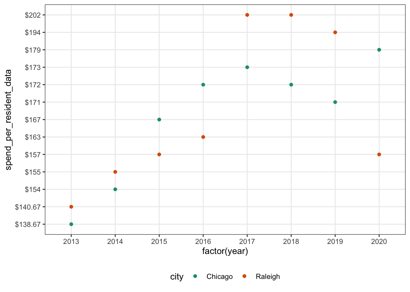
Next, let’s do a scatter plot! This code looks very similar to the bar plot code. Main changes: using geom_point() instead of geom_bar(). Also, I used color to change the color of the dots based on the city. This ends up being a bit harder to read than the bar plot.
ggplot(parks_dat, aes(x = factor(year), y = spend_per_resident_data, color = city)) +
  geom_point(aes(group = city)) +
  gglayer_theme
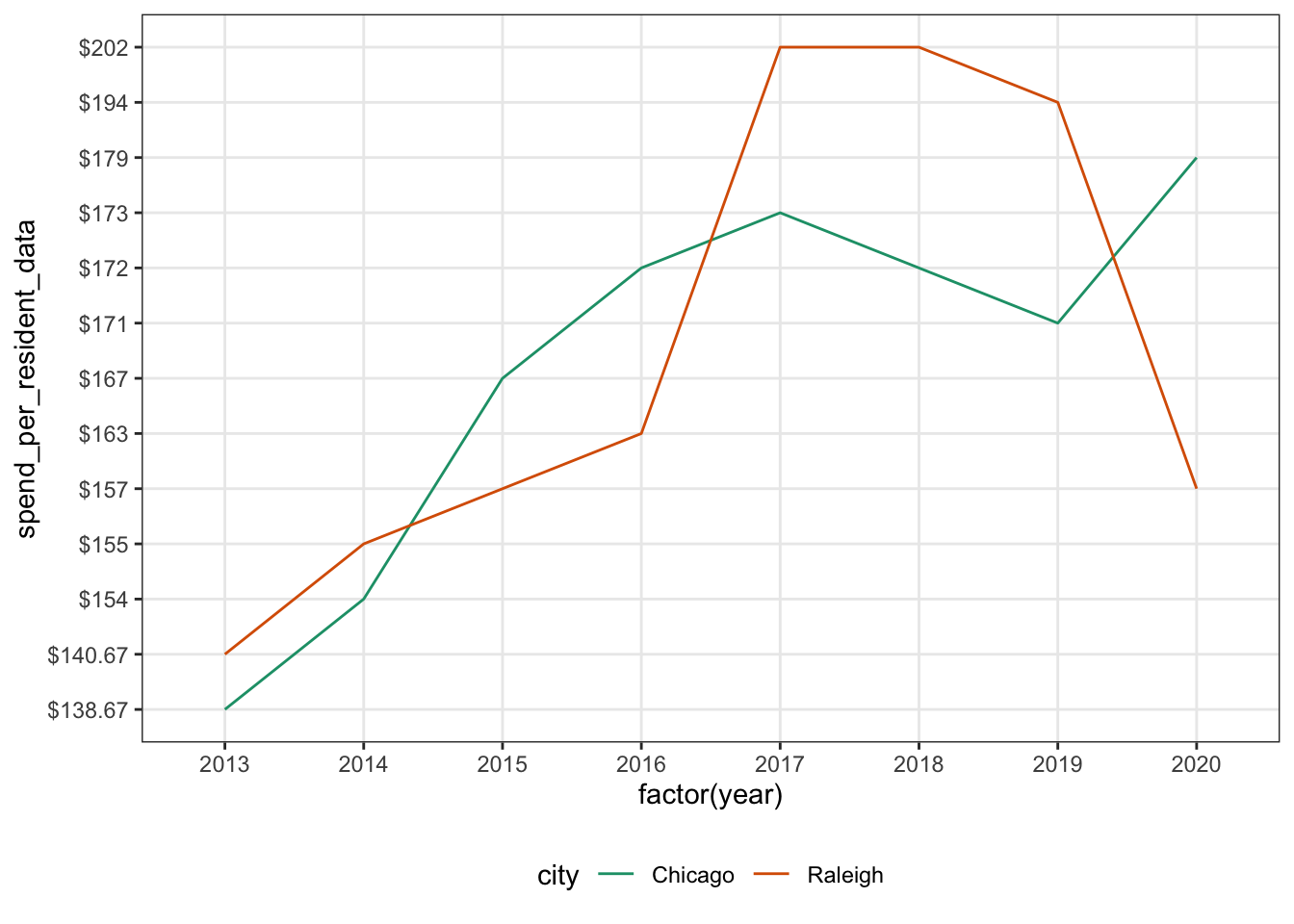
Let’s look at a line plot next! This is the exact same code as the scatter plot except we changed geom_point() to geom_line(). This looks better but it’s still tough to quickly see the values for each year.
ggplot(parks_dat, aes(x = factor(year), y = spend_per_resident_data, color = city)) +
  geom_line(aes(group = city)) +
  gglayer_theme
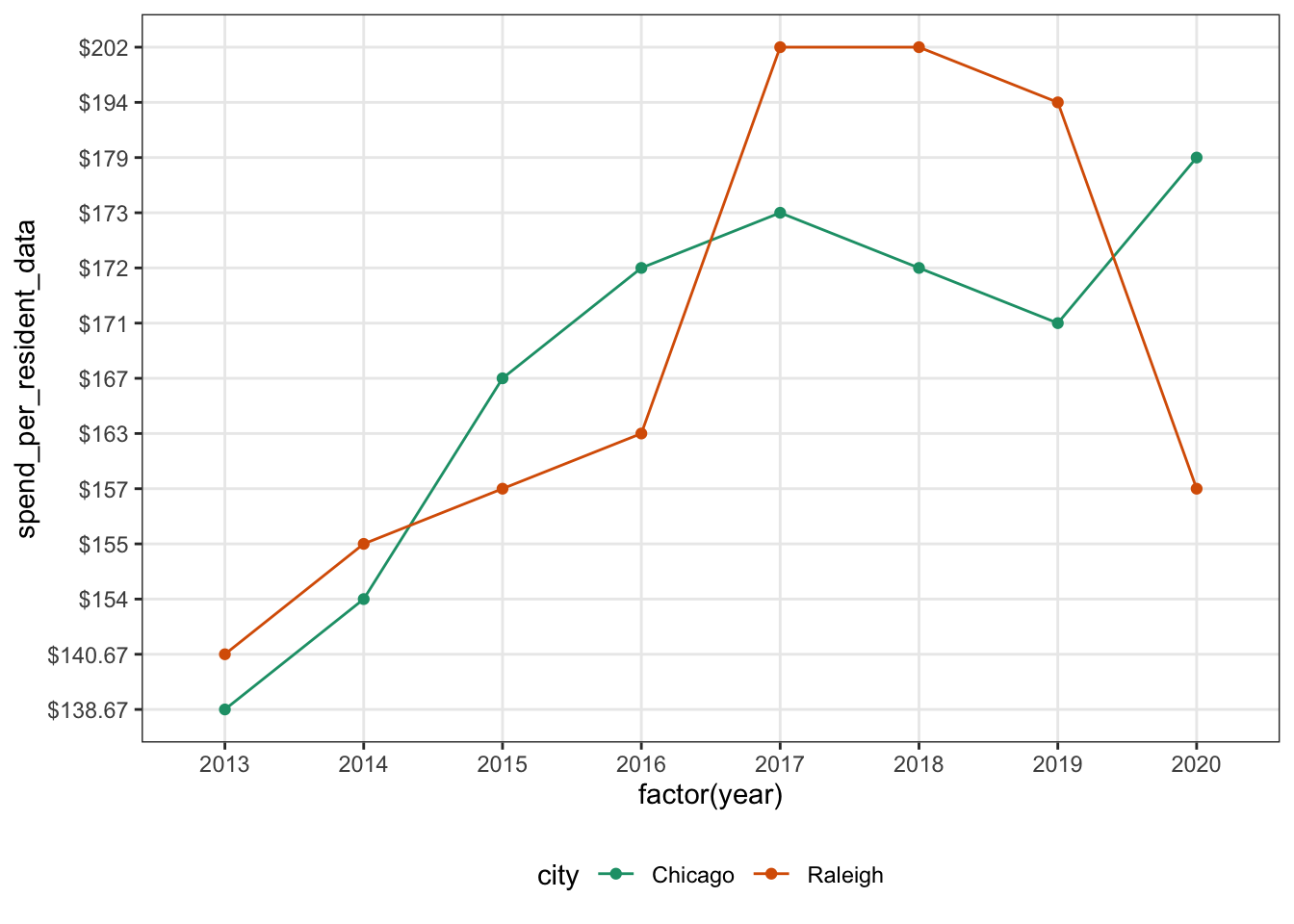
We can combine the scatter plot & line plot to get a better plot! To get this, we use both geom_line() & geom_point(). This is much more readable. Looks good!
ggplot(parks_dat, aes(x = factor(year), y = spend_per_resident_data, color = city)) +
  geom_line(aes(group = city)) +
  geom_point() +
  gglayer_theme
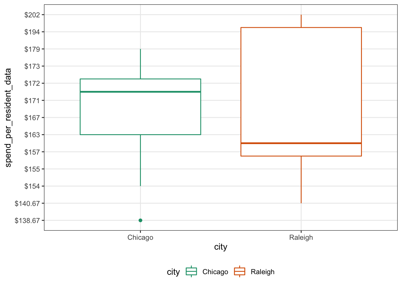
Next up, we’ll do a box plot. Box plots allow us to see the distribution of each group. It also lets us do a quick comparison of the median. Once again, we just swap out the geom call.
ggplot(parks_dat, aes(x = city, y = spend_per_resident_data, color = city)) +
  geom_boxplot(aes(group = city)) +
  gglayer_theme
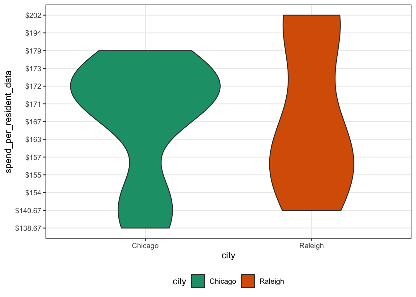
Last up, let’s do a quick violin plot. Similar to a box plot, but the shape allows us to see where the distribution is highest. Here we use, geom_violin() to get the violin plot.
ggplot(parks_dat, aes(x = city, y = spend_per_resident_data, fill = city)) +
  geom_violin(aes(group = city)) +
  gglayer_theme
This wraps up a (very) brief refresher on some basic plot types. Feel free to reach out with any questions/comments/concerns via Twitter or using one of the other methods on my contact page. Thanks for reading!