I’m going to use some early data from the first week of #TidyTuesday to do a comparison of different methods for making a heat map. The three packages I’m going to compare are ggplot2, pheatmap, & ComplexHeatmap.
The first package I’m going to look at is ggplot2, an integral part of the tidyverse.** You can create a heat map in ggplot2 using geom_tile(). One of the pros of making any type of plot in ggplot2 is it plays well with other types of plots made in ggplot2. This allows you to combine many different types of plots into a single figure in a pretty straight forward fashion (for example, a heat map & a bar plot together). They all follow a similar pattern so once you get the hang of how to make one type of plot, you can apply those principles to other types of plots. The only big negative I can think of for making heat maps in ggplot2 is it’s a bit more difficult to cluster your data. It’s not impossible, but it’s quite a bit of extra work as compared to other packages.
Let’s start by creating a heat map of our data in ggplot2. In Part 2 & Part 3 of this post, I’ll recreate that plot using pheatmap & https://jokergoo.github.io/ComplexHeatmap-reference/book/.
** To clarify, calling ggplot2 a heat map package is trivializing the sheer number of things you can do with it. However, in this case, we’re only interested in the heat map capabilities.
A quick description of our data. 
This data is the average in-state tuition & fees for one year of full time study at a public 4 year institution for each state from the 2004-2005 school year to 2015-2016. You can download the data here.
Let’s get started! First, let’s load the libraries we’re going to use.
library(tidyverse)
library(RColorBrewer)
Next, I want to read in the file we’re going to get our data from. I saved it to my Github so I’ll have it for future use. Also, this way I can read it in from anywhere. I’m using read_csv() to read the file into an object named df. Then we can use df to see what our data looks like.
df = read_csv("https://raw.githubusercontent.com/sapo83/TidyTuesday/master/2018/TT.20180403/us.avg.tuition.noCR.csv")
##
## ── Column specification ────────────────────────────────────────────────────────
## cols(
##   State = col_character(),
##   `2004-05` = col_character(),
##   `2005-06` = col_character(),
##   `2006-07` = col_character(),
##   `2007-08` = col_character(),
##   `2008-09` = col_character(),
##   `2009-10` = col_character(),
##   `2010-11` = col_character(),
##   `2011-12` = col_character(),
##   `2012-13` = col_character(),
##   `2013-14` = col_character(),
##   `2014-15` = col_character(),
##   `2015-16` = col_character()
## )
df
## # A tibble: 50 x 13
##    State   `2004-05` `2005-06` `2006-07` `2007-08` `2008-09` `2009-10` `2010-11`
##    <chr>   <chr>     <chr>     <chr>     <chr>     <chr>     <chr>     <chr>
##  1 Alabama $5,683    $5,841    $5,753    $6,008    $6,475    $7,189    $8,071
##  2 Alaska  $4,328    $4,633    $4,919    $5,070    $5,075    $5,455    $5,759
##  3 Arizona $5,138    $5,416    $5,481    $5,682    $6,058    $7,263    $8,840
##  4 Arkans… $5,772    $6,082    $6,232    $6,415    $6,417    $6,627    $6,901
##  5 Califo… $5,286    $5,528    $5,335    $5,672    $5,898    $7,259    $8,194
##  6 Colora… $4,704    $5,407    $5,596    $6,227    $6,284    $6,948    $7,748
##  7 Connec… $7,984    $8,249    $8,368    $8,678    $8,721    $9,371    $9,827
##  8 Delawa… $8,353    $8,611    $8,682    $8,946    $8,995    $9,987    $10,534
##  9 Florida $3,848    $3,924    $3,888    $3,879    $4,150    $4,783    $5,511
## 10 Georgia $4,298    $4,492    $4,584    $4,790    $4,831    $5,550    $6,428
## # … with 40 more rows, and 5 more variables: 2011-12 <chr>, 2012-13 <chr>,
## #   2013-14 <chr>, 2014-15 <chr>, 2015-16 <chr>
So far everything looks good! The first thing I want to do is remove the dollar signs & the commas from each value. This will make it easier to work with.
Let’s break the command down. gsub() is used to substitute a pattern with a new pattern. The general pattern is gsub("old_pattern", "new_pattern", object). Here I’m looking for either a dollar sign or comma [$,] & replacing it with nothing "". I’m using lapply() to apply this function to each column. Here the x represents the argument being passed to the function. In this case the argument is a column from my data frame as a list. I wrap the whole command in as.data.frame() so that the returned object is a data frame.
df = as.data.frame(lapply(df, function (x) {gsub("[$,]", "", x)}))

head(df)
##        State X2004.05 X2005.06 X2006.07 X2007.08 X2008.09 X2009.10 X2010.11
## 1    Alabama     5683     5841     5753     6008     6475     7189     8071
## 2     Alaska     4328     4633     4919     5070     5075     5455     5759
## 3    Arizona     5138     5416     5481     5682     6058     7263     8840
## 4   Arkansas     5772     6082     6232     6415     6417     6627     6901
## 5 California     5286     5528     5335     5672     5898     7259     8194
## 6   Colorado     4704     5407     5596     6227     6284     6948     7748
##   X2011.12 X2012.13 X2013.14 X2014.15 X2015.16
## 1     8452     9098     9359     9496     9751
## 2     5762     6026     6012     6149     6571
## 3     9967    10134    10296    10414    10646
## 4     7029     7287     7408     7606     7867
## 5     9436     9361     9274     9187     9270
## 6     8316     8793     9293     9299     9748
Next, I need this data frame to be in long format instead of wide.
A bit about long versus wide. 
Generally, to plot data using ggplot the data needs to be in long format. This means one observation in each row. This also means a single subject with multiple measurements will have multiple rows in the data frame. In our melted data frame, you can see each state (the subject) has multiple rows. Each row corresponds to a single measurement (tuition for a specific academic year).
When a single subject has one row with multiple measurements then the data is in wide format. In our original data frame, each row had one state (the subject) with multiple measurements in each row (each column represents one measurement).
Here I’m going to use melt() from the reshape2 package. Another option is pivot_longer() from the tidyr package. tidyr is loaded as part of the tidyverse library. Here is a vignette to learn more about pivot_longer() and pivot_wider().
In the melt, I used variable = "Years" to specify the variable column to be named Years. I used value.name = "Tuition" to specify that I want the value column named Tuition.
Along with the melt, I also want to correct how the years are written. After the melt, the “Years” column looks like X2005.06. I don’t like that. Again, I’m using gsub() as a find and replace. I nested two gsub() commands to first replace the X with nothing & then replace the . with -20.
Last thing! After the melt, “Tuition” is changed to a character column. This interferes with plotting our data later. In the mutate() call, I’m going to use as.numeric() to change it back to a number.
Now everything looks better!
melted_df = reshape2::melt(df, id.vars = "State", variable = "Years",
                           value.name = "Tuition") %>%
  mutate(Years = gsub("[.]", "-20", gsub("X", "", Years)), Tuition = as.numeric(Tuition))

head(melted_df)
##        State     Years Tuition
## 1    Alabama 2004-2005    5683
## 2     Alaska 2004-2005    4328
## 3    Arizona 2004-2005    5138
## 4   Arkansas 2004-2005    5772
## 5 California 2004-2005    5286
## 6   Colorado 2004-2005    4704
Now that we have our melted data frame, let’s make a heat map!
ggplot(data = melted_df, aes(x = Years, y = State, fill = Tuition)) +
  geom_tile()
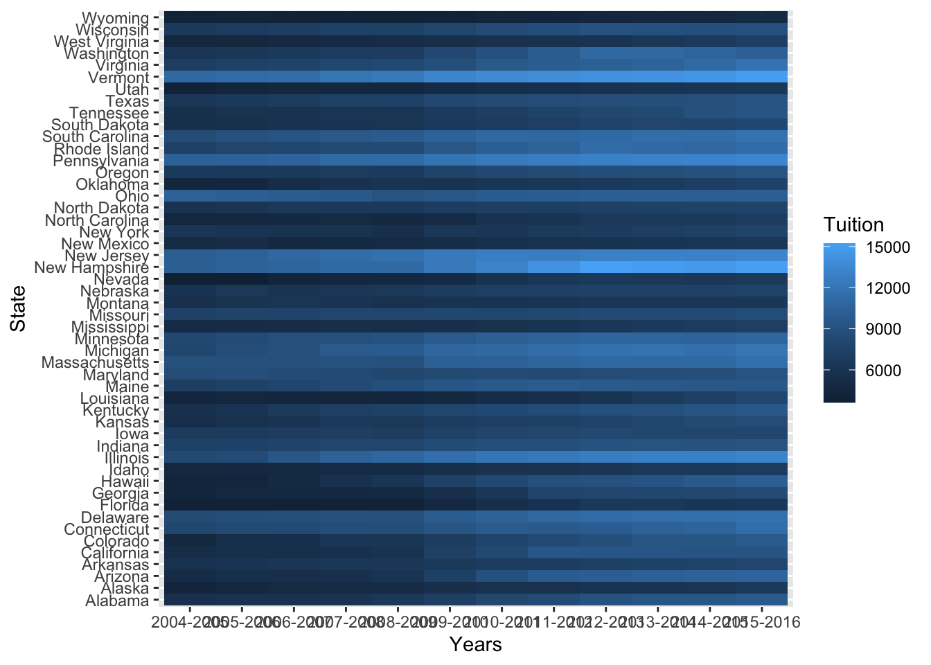
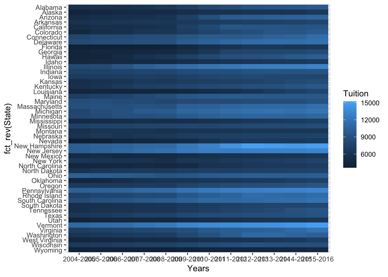
Not bad! One of the first things I noticed is that y axis is out of order. I’d like to see those states in alphabetical order. We can use fct_rev() to reverse the order.
ggplot(data = melted_df, aes(x = Years, y = fct_rev(State), fill = Tuition)) +
  geom_tile()
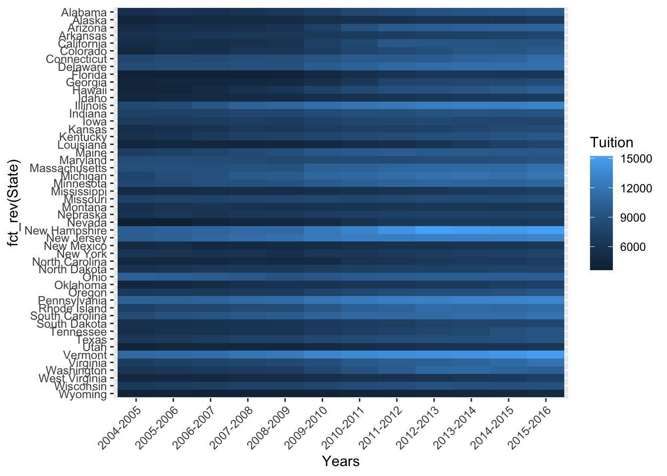
Better! Next I want to rotate the x axis labels so they are more readable. We can do this using a call to theme(). We specify axis.text.x = element_text(angle = 45, hjust = 1, vjust = 1) to rotate the labels & then center them on the tick mark.
ggplot(data = melted_df, aes(x = Years, y = fct_rev(State), fill = Tuition)) +
  geom_tile() +
  theme(axis.text.x = element_text(angle = 45, hjust = 1, vjust = 1))
Last up, I want to change the color palette & relabel the axes. I really like the “red, yellow, blue” palette from ColorBrewer. I adapted it here to use as a continuous scale. To relabel the axes, I use a call to lab().
cols = colorRampPalette(rev(brewer.pal(11, "RdYlBu")))

ggplot(data = melted_df, aes(x = Years, y = fct_rev(State), fill = Tuition)) +
  geom_tile() +
  scale_fill_gradientn(colours = cols(11)) +
  labs(y = "State",
       x = "Years",
       fill = "Tuition ($)") +
  theme(axis.text.x = element_text(angle = 45, hjust = 1, vjust = 1))
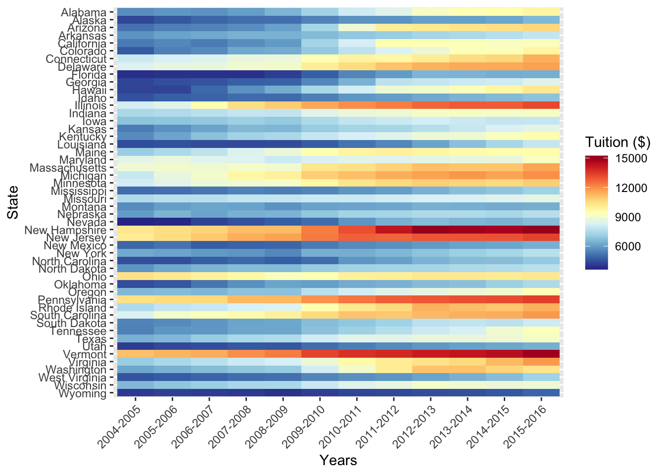
That looks good! I’m going to call this done! If you have any questions, feel free to reach out to me on Twitter. Head over to Part 2 or Part 3.