We’re back to look at another heat map package! This is Part 2 of a 3 part series. You can find Part 1 here.
As someone who learned R using primarily the tidyverse, pheatmap had a bit of a learning curve. As a grad student, I was looking for an easier way to make a heat map with clustered data. I was trying to make heat maps for about 50 gene clusters in a programmatic way. ggplot2 wasn’t cutting it for me so I landed here. The end result was this figure & this figure, both published in this paper.
We’re going to use the same data as before. A lot of the data wrangling will look similar to Part 1.
First, we’re going to load the libraries will be using.
library(tidyverse)
library(RColorBrewer)
library(pheatmap)
Next, we’re going to read in the file using read_csv() from the tidyverse package.
df = read_csv("https://raw.githubusercontent.com/sapo83/TidyTuesday/master/2018/TT.20180403/us.avg.tuition.noCR.csv")
##
## ── Column specification ────────────────────────────────────────────────────────
## cols(
##   State = col_character(),
##   `2004-05` = col_character(),
##   `2005-06` = col_character(),
##   `2006-07` = col_character(),
##   `2007-08` = col_character(),
##   `2008-09` = col_character(),
##   `2009-10` = col_character(),
##   `2010-11` = col_character(),
##   `2011-12` = col_character(),
##   `2012-13` = col_character(),
##   `2013-14` = col_character(),
##   `2014-15` = col_character(),
##   `2015-16` = col_character()
## )
df
## # A tibble: 50 x 13
##    State   `2004-05` `2005-06` `2006-07` `2007-08` `2008-09` `2009-10` `2010-11`
##    <chr>   <chr>     <chr>     <chr>     <chr>     <chr>     <chr>     <chr>
##  1 Alabama $5,683    $5,841    $5,753    $6,008    $6,475    $7,189    $8,071
##  2 Alaska  $4,328    $4,633    $4,919    $5,070    $5,075    $5,455    $5,759
##  3 Arizona $5,138    $5,416    $5,481    $5,682    $6,058    $7,263    $8,840
##  4 Arkans… $5,772    $6,082    $6,232    $6,415    $6,417    $6,627    $6,901
##  5 Califo… $5,286    $5,528    $5,335    $5,672    $5,898    $7,259    $8,194
##  6 Colora… $4,704    $5,407    $5,596    $6,227    $6,284    $6,948    $7,748
##  7 Connec… $7,984    $8,249    $8,368    $8,678    $8,721    $9,371    $9,827
##  8 Delawa… $8,353    $8,611    $8,682    $8,946    $8,995    $9,987    $10,534
##  9 Florida $3,848    $3,924    $3,888    $3,879    $4,150    $4,783    $5,511
## 10 Georgia $4,298    $4,492    $4,584    $4,790    $4,831    $5,550    $6,428
## # … with 40 more rows, and 5 more variables: 2011-12 <chr>, 2012-13 <chr>,
## #   2013-14 <chr>, 2014-15 <chr>, 2015-16 <chr>
Next, we’re going to use gsub() to replace all the dollar signs & commas. lapply() allows us to apply this to every column in our data frame.
df = as.data.frame(lapply(df, function (x) {gsub("[$,]", "", x)}))

head(df)
##        State X2004.05 X2005.06 X2006.07 X2007.08 X2008.09 X2009.10 X2010.11
## 1    Alabama     5683     5841     5753     6008     6475     7189     8071
## 2     Alaska     4328     4633     4919     5070     5075     5455     5759
## 3    Arizona     5138     5416     5481     5682     6058     7263     8840
## 4   Arkansas     5772     6082     6232     6415     6417     6627     6901
## 5 California     5286     5528     5335     5672     5898     7259     8194
## 6   Colorado     4704     5407     5596     6227     6284     6948     7748
##   X2011.12 X2012.13 X2013.14 X2014.15 X2015.16
## 1     8452     9098     9359     9496     9751
## 2     5762     6026     6012     6149     6571
## 3     9967    10134    10296    10414    10646
## 4     7029     7287     7408     7606     7867
## 5     9436     9361     9274     9187     9270
## 6     8316     8793     9293     9299     9748
Looks good so far!
One of the quirks of pheatmap is that it will only accept a matrix with numeric values. This caused me the most trouble when I first started using this package. To handle this, we’ll apply (using sapply()) the as.numeric() function to each column except the first column. We’ll then assign this as a matrix (using as.matrix()) to a new object (df_num). Our row names for our new object are the states. We set the row names for df_num using the first column from our original data frame (df).
df_num = as.matrix(sapply(df[, 2:13], as.numeric))

rownames(df_num) = df$State

head(df)
##        State X2004.05 X2005.06 X2006.07 X2007.08 X2008.09 X2009.10 X2010.11
## 1    Alabama     5683     5841     5753     6008     6475     7189     8071
## 2     Alaska     4328     4633     4919     5070     5075     5455     5759
## 3    Arizona     5138     5416     5481     5682     6058     7263     8840
## 4   Arkansas     5772     6082     6232     6415     6417     6627     6901
## 5 California     5286     5528     5335     5672     5898     7259     8194
## 6   Colorado     4704     5407     5596     6227     6284     6948     7748
##   X2011.12 X2012.13 X2013.14 X2014.15 X2015.16
## 1     8452     9098     9359     9496     9751
## 2     5762     6026     6012     6149     6571
## 3     9967    10134    10296    10414    10646
## 4     7029     7287     7408     7606     7867
## 5     9436     9361     9274     9187     9270
## 6     8316     8793     9293     9299     9748
One last thing before we get to plotting our heat map: column names! The column names need to be cleaned up a bit.
We’ll used two nested gsub() commands to remove the “X” from the beginning of the string & replace the “-” with “-20”.
colnames(df_num) = gsub("[.]", "-20", gsub("X", "", colnames(df_num)))
Now, let’s plot our heat map!
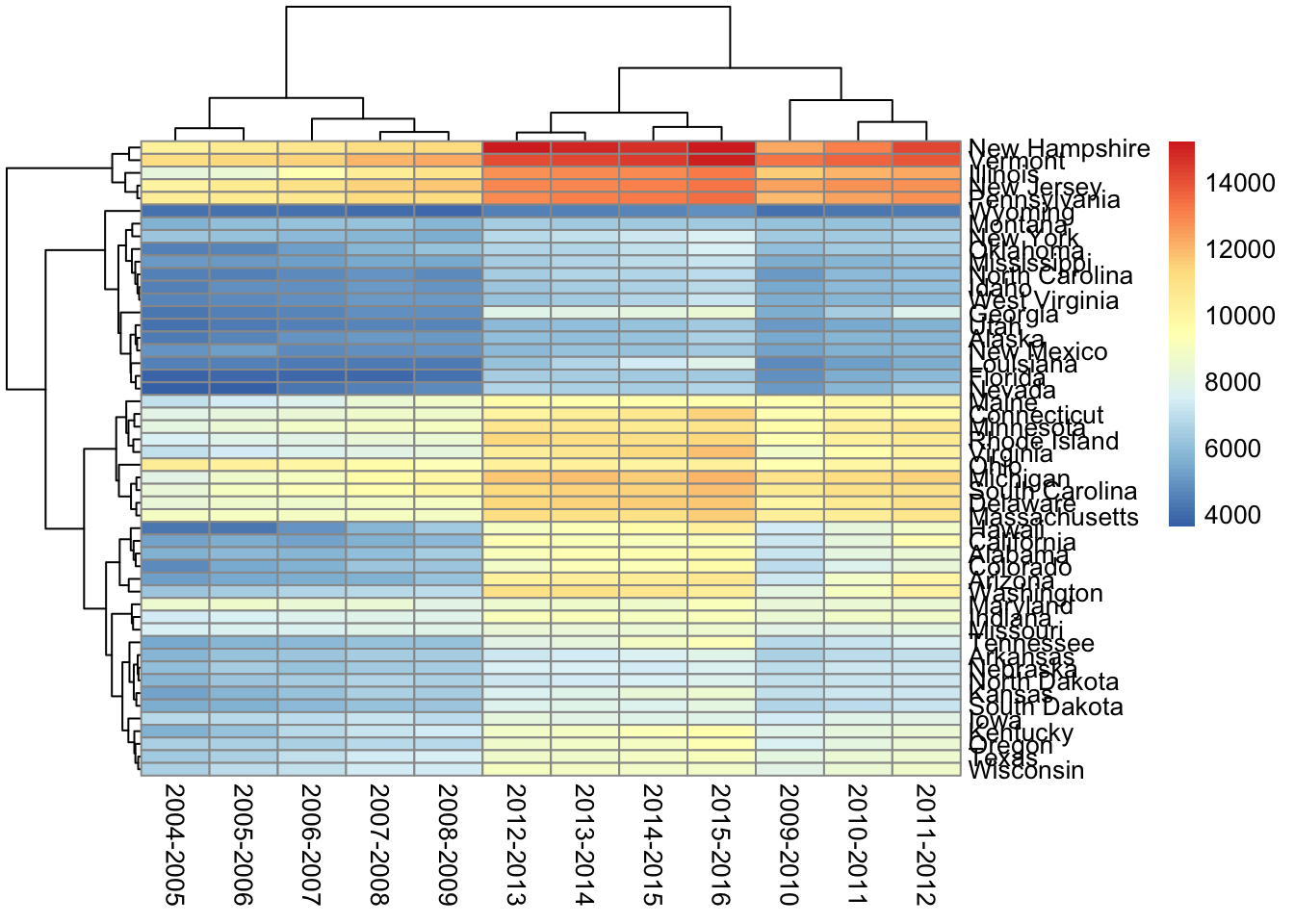
pheatmap(df_num)
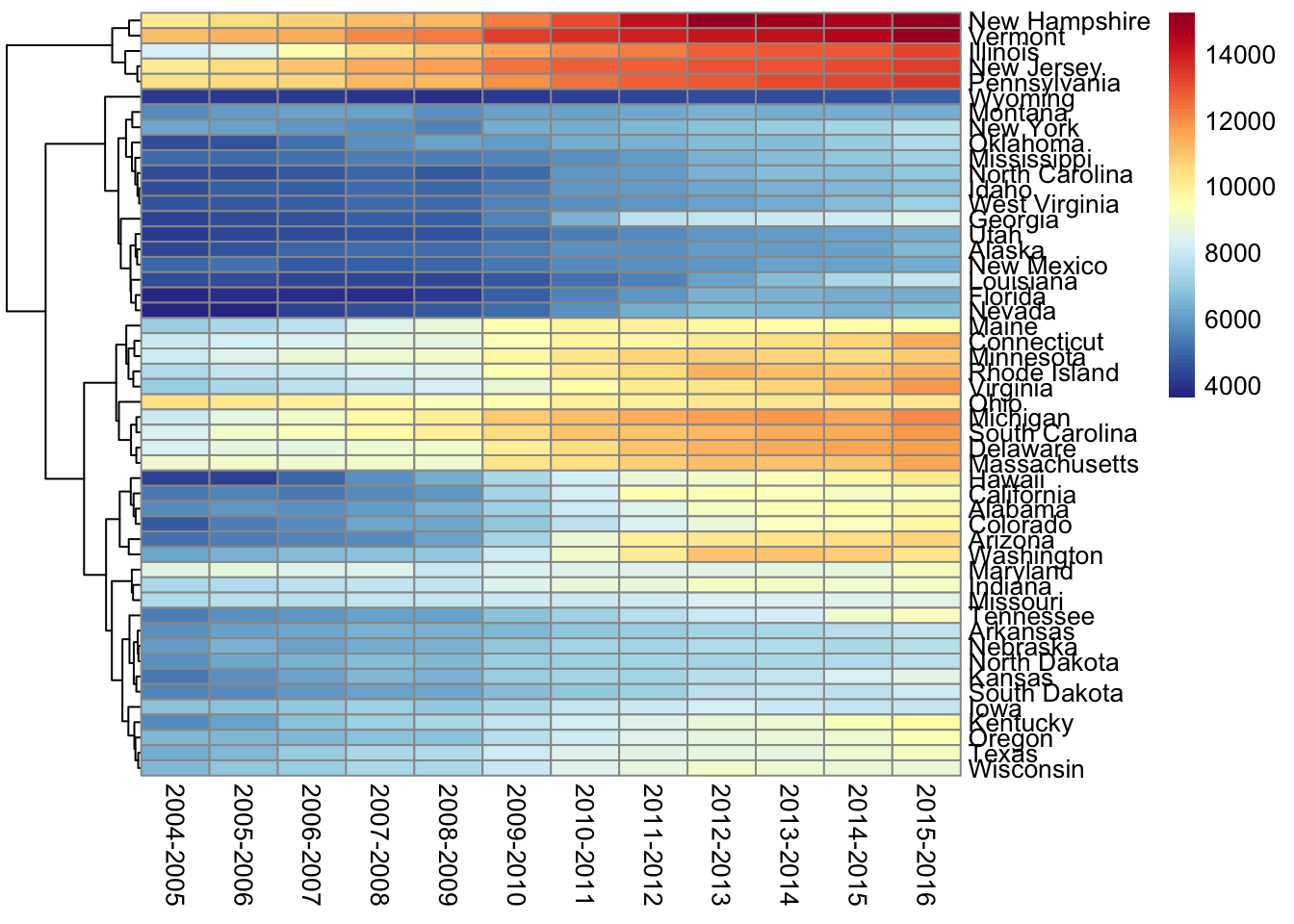
First thing I want to fix is the column order. I don’t want them clustered. I want to see them in order by date. We can add cluster_cols = FALSE to take care of that. I’ll leave the clustering on for the rows (states). With this clustering we can see which states have similar patterns in their tuition changes. This may help us see particular trends in certain regions or identify outlier(s) in a specific area.
I also want to add a color scheme to it. I’m going to stick with the color palette from Part 1.
pheatmap(df_num,
         color = colorRampPalette(rev(brewer.pal(11, "RdYlBu")))(100),
         cluster_cols = FALSE)
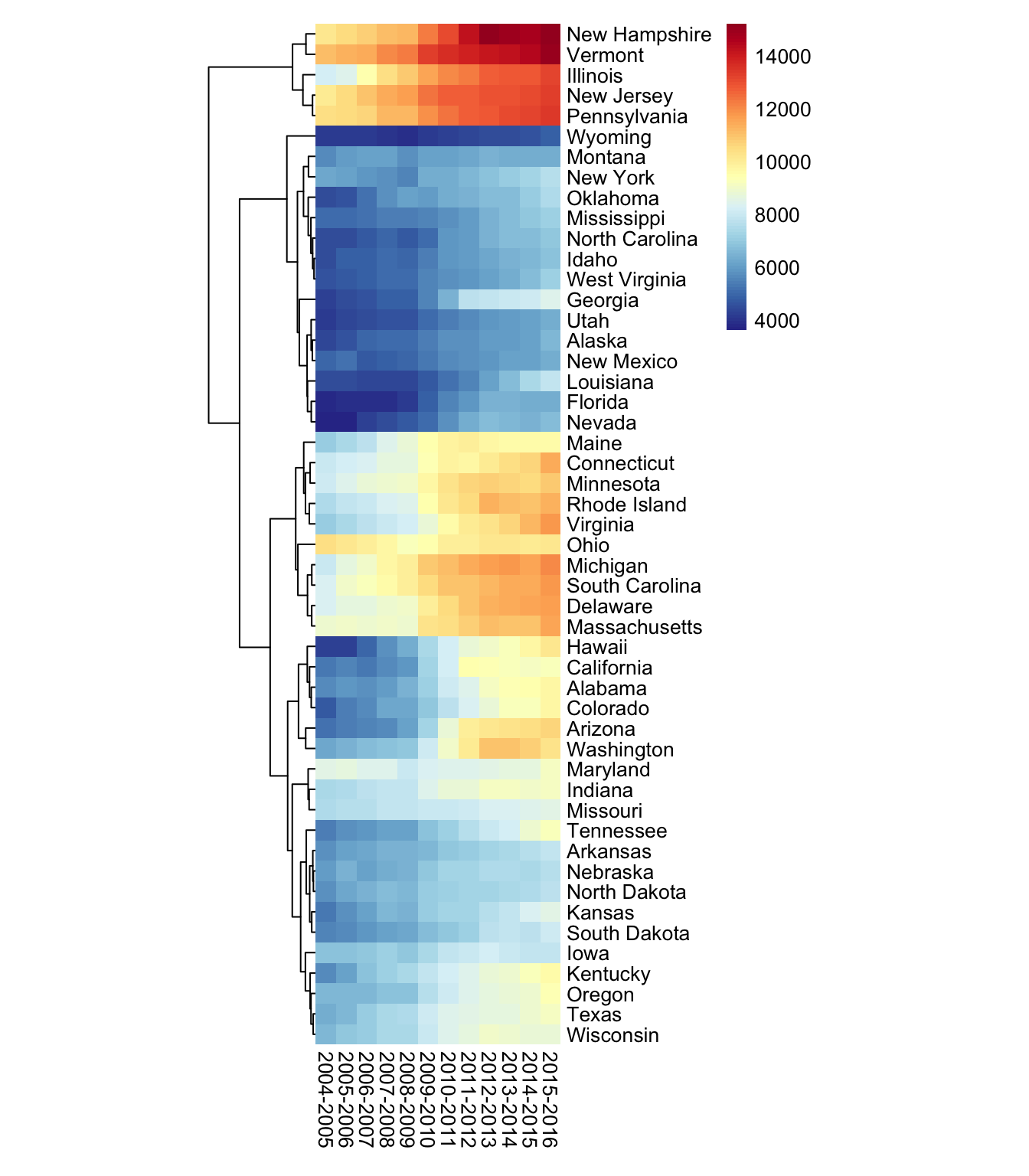
Next I want to change the cell size & remove the cell border. I’ll use NA to remove the cell border completely. I prefer squares in a heat map as opposed to rectangles so I’ll set the cell width & cell height to match.
pheatmap(df_num,
         color = colorRampPalette(rev(brewer.pal(11, "RdYlBu")))(100),
         cluster_cols = FALSE,
         cellwidth = 10,
         cellheight = 10,
         border_color = NA)
This is fairly similar to the plot in Part 1 so I’m going to stop here. Any questions/comments/concerns, I’d be happy to hear from you. You can reach out to me via Twitter or using one of the other methods on my contact page. Stay tuned for Part 3!